design system
the problem
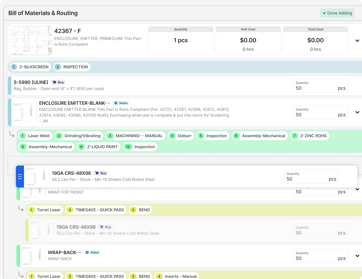
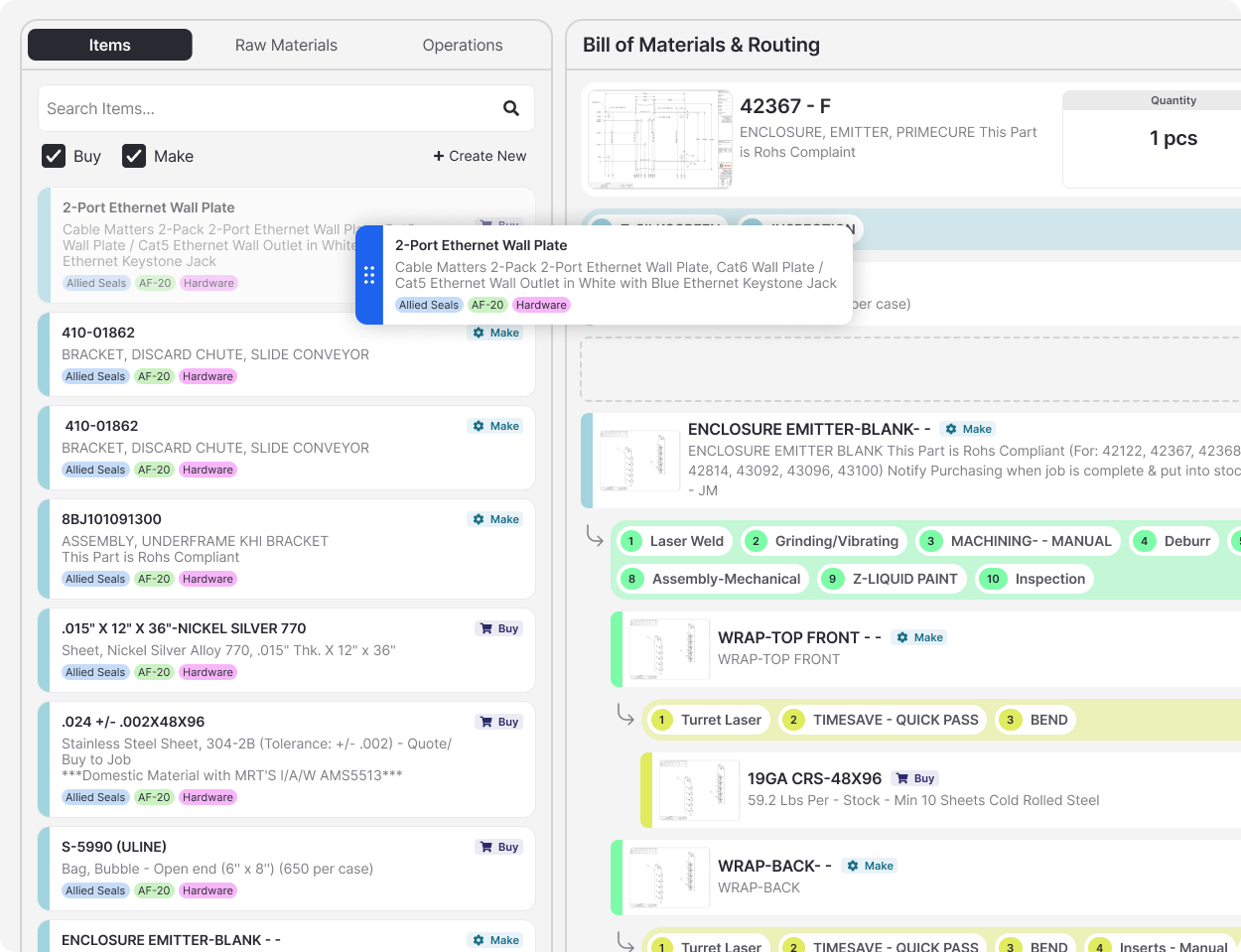
In Fulcrum’s first year as a product company, we were moving fast and solving problems one at a time. Without a component library, designers and engineers kept rebuilding the same patterns, and the product felt increasingly disjointed to the customers learning it.
the research
full product audit
customer & internal team interviews
sales demos & onboarding session reviews
atomic design research
my role
User research, design principles, components design, frontend component styling
the team
3 designers, 3 engineers
the timeline
6 months (engineering buildout continued beyond)
the tools
Figma, Storybook, VS Code
the goal
Make Fulcrum feel like one product, consistent in look and behavior yet flexible enough for very different customer workflows.
the solution
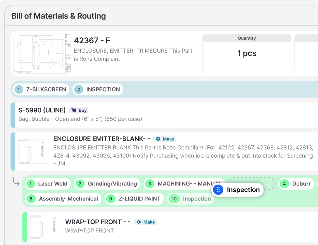
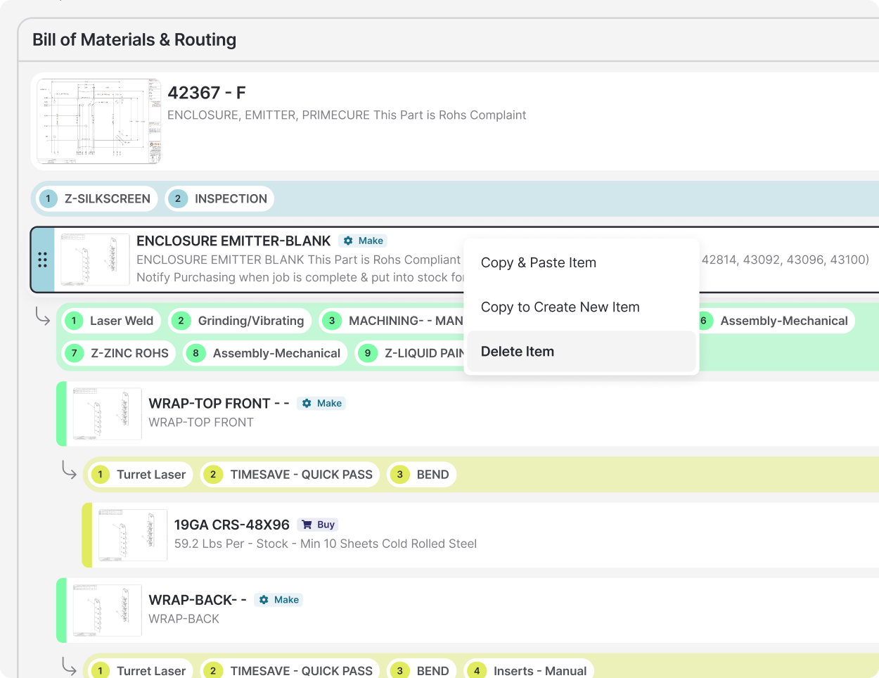
A complete Figma library covering color, typography, inputs, buttons, and a 12-column grid, structured with Atomic Design so every pattern builds from the same foundations. Five principles to guide development decisions, and key components like inputs and panels were built in code so design and engineering work from the same pieces.
the impact
Development and decision-making got faster for years to come, and customers could pick up each new feature without relearning the product.